An App With Room for Everything
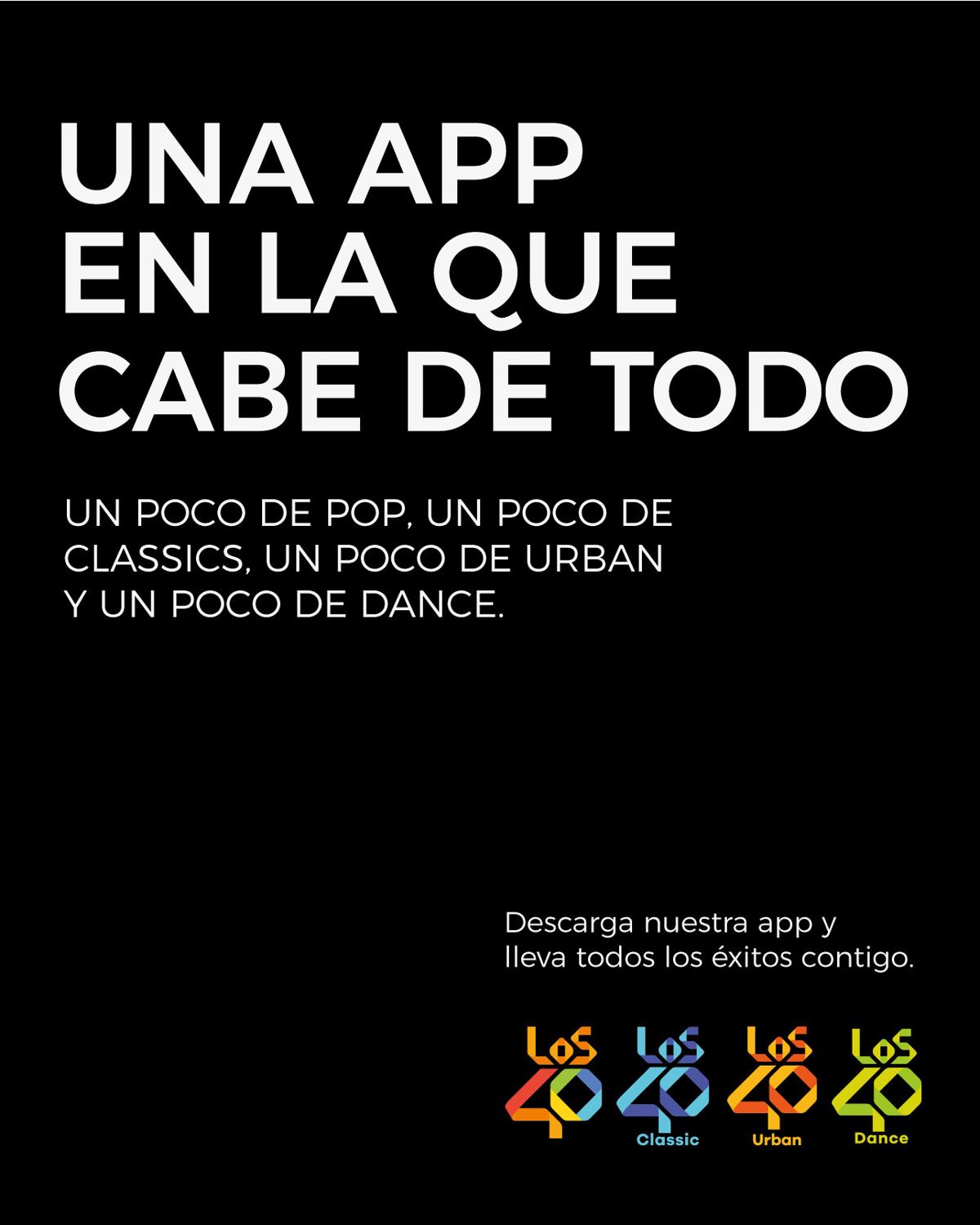
Radio has always asked listeners to pick a side: pop or classics, urban or dance. LOS40 has just made that choice unnecessary. Its app brings together all of the group’s stations in a single place, and our brief was to make people understand it, using only LOS40’s own media.
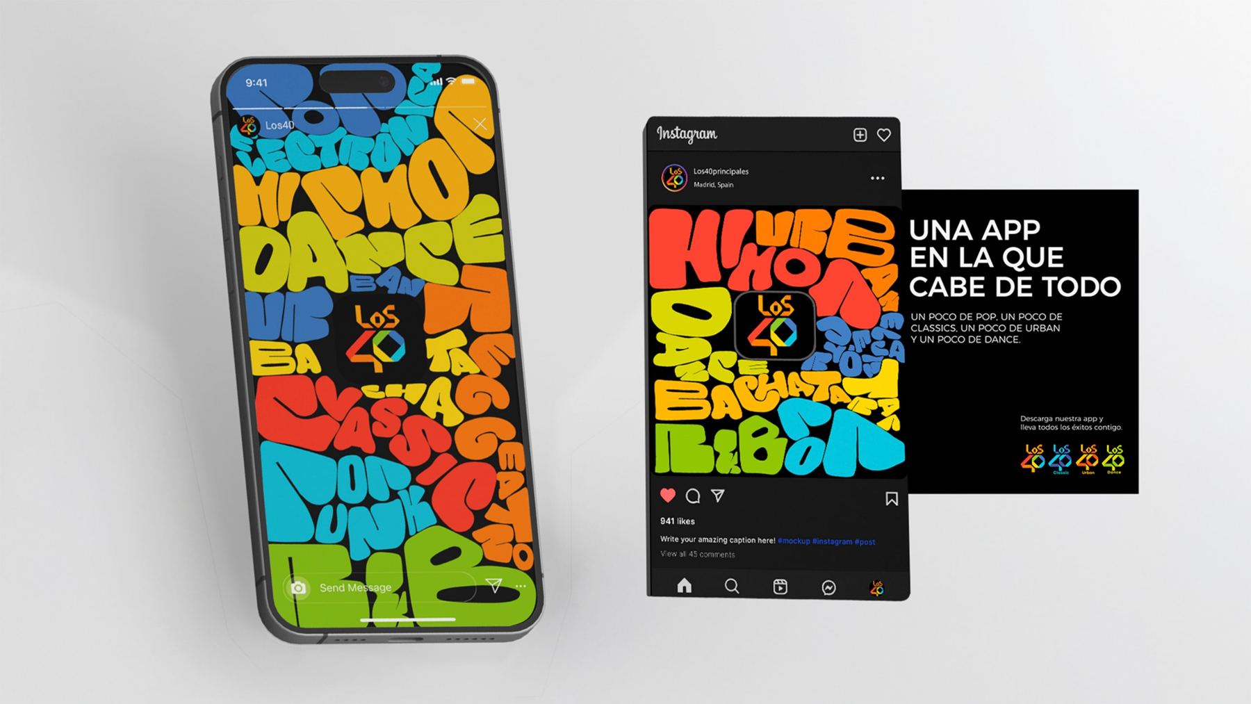
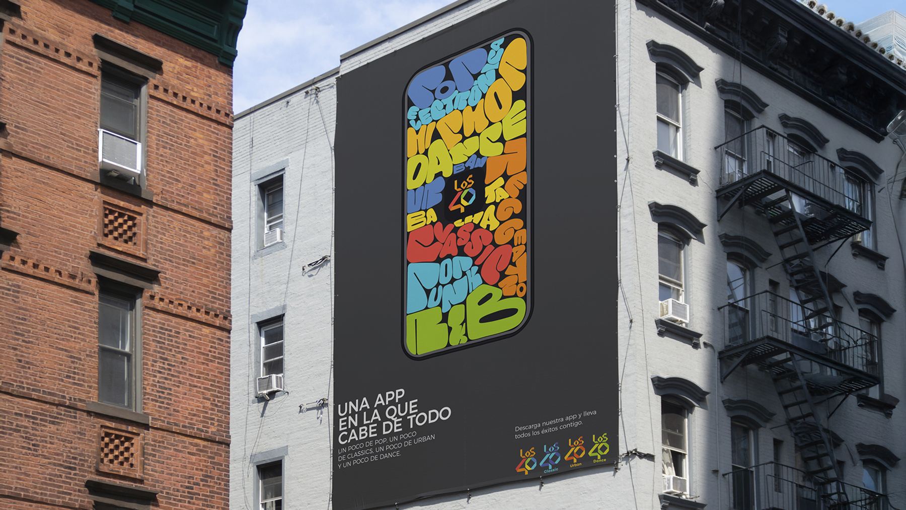
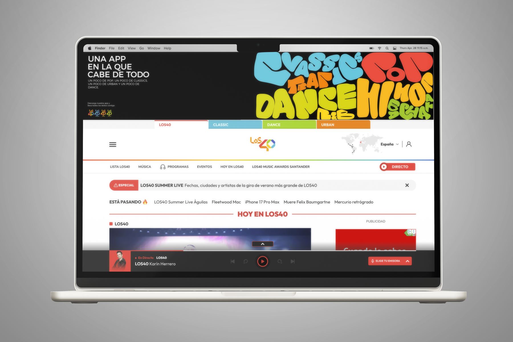
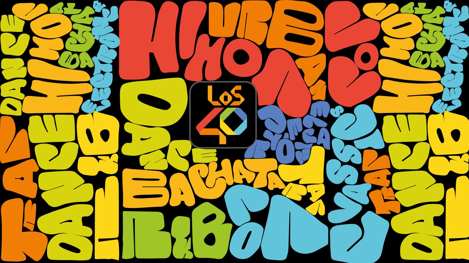
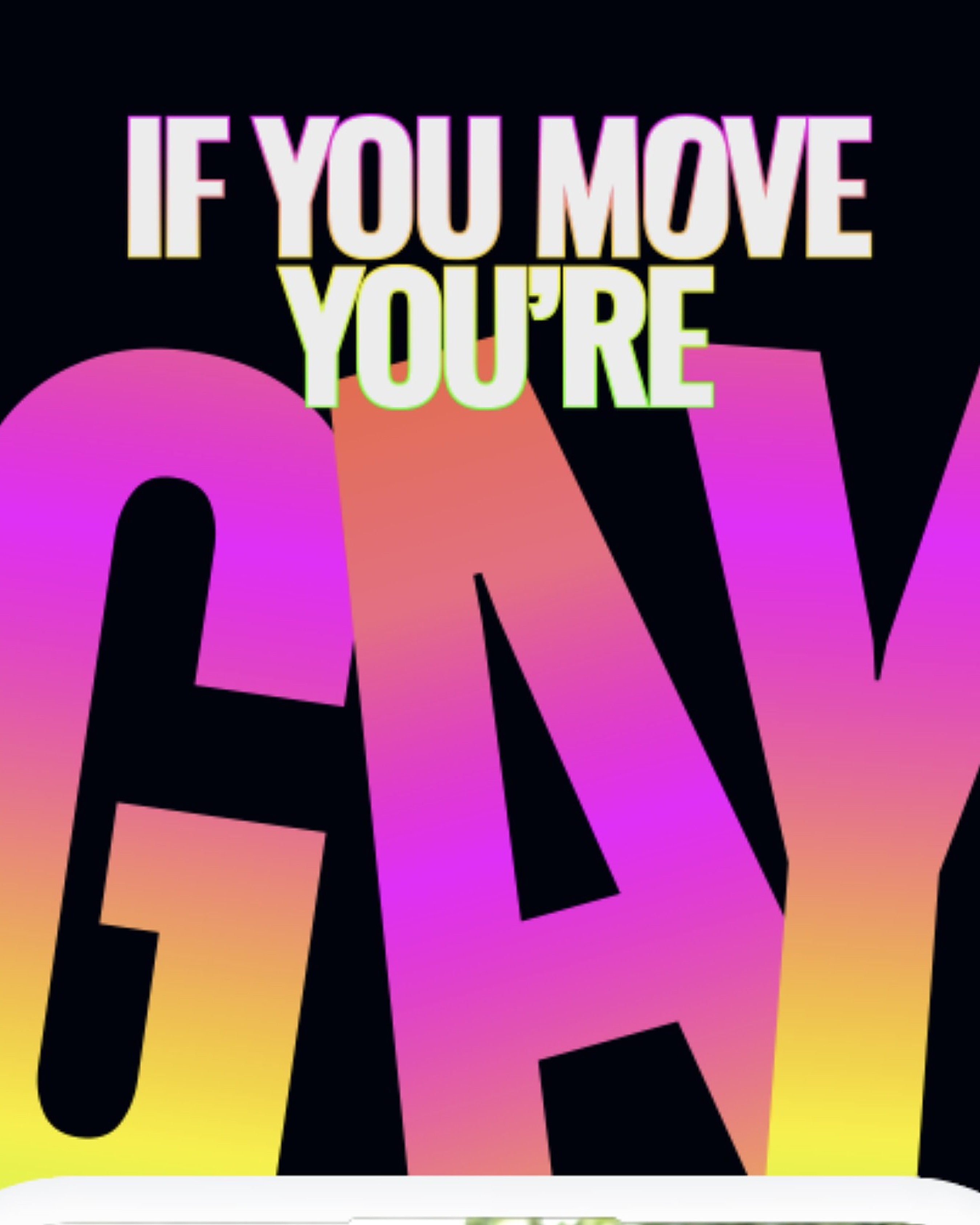
Our answer starts from a simple idea: if everything fits in one app, everything has to fit in one frame. “Una app en la que cabe de todo” became a typographic universe where every genre (Pop, Classics, Trap, Dance, R&B, Hip Hop, Bachata) is a swollen, inflated letterform fighting for space with its neighbors. They are packed so tight that they squeeze, overlap and bump into each other: music that rarely shares a stage, living side by side in one place. In motion, the letters swell and collide like balloons, and the copy delivers the promise in a single line: a bit of pop, a bit of classics, a bit of urban and a bit of dance.
Make some room. :)